
I’ve never liked pastels, and for some reason, when people used to give me art supplies, they always gave me pastels. Because I was a glitzy Southern Californian beach gurl, they gave me shimmery pastels!
I find them clumsy, thick, and I have trouble getting detail. I’m not Monet, so not into suggesting with dots of color, or blends of color.
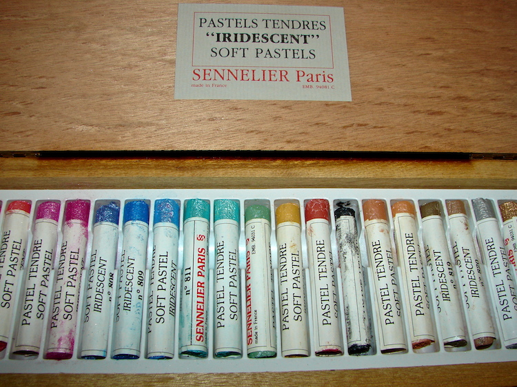 I have this amazing box of Sennelier iridescent (not really me either) pastels, and I have NEVER USED THEM. Then I came across someone saying they water-colored across their pastel. Hmmm. Online, I checked out things-one-can-do with pastels, and found I could do exactly that.
I wish I could tell you that playing around (below) changed my mind. I am still not in love with them, BUT, I will keep one box as I am gifting supplies (I have two) I will never use, and maybe someday will play with them again.
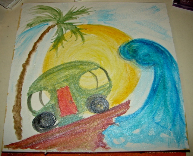
Below, I started with crude fast colors on a sheet in a doodle I often do of the RV we hope to own. I used my water brush to blend. Not a great work of art, but a good test, and I think it is good to show your simply awful work, because so many artists hide their experiments.
Sennelier pastels don’t layer well. I tried adding orange on top of the yellow sun, and it was a streaky mess. Also, the Sennelier doesn’t like to be mixed with other watercolor crayon bits, like Neocolor II — or the Neocolor doesn’t like the Sennelier. And it was not compatible with the Stabilo silver watercolor pencil I tried. Some of the streaky bits were me playing with a mixed bag.
Sometime I will try again . . . as I said, if I can use them like Neocolor II, possibly I will find a time and place when they are perfect for what I am imagining!

I am now agreeing to the Creative Commons Attribution-Non-Commercial 4.0 International License, which you can learn more about by visiting the site, or, visit my web page for a more user-friendly summary on my terms. My images/blog posts can be reposted; please link back to dkatiepowellart.


I don’t like pastels either. Probably because I don’t know how to use them! I’m never sure if I’m supposed to blend them and they are so messy. Lol! One of these days I should give them another chance.
LikeLike
Should. That is the word I use when it comes to this box of pastels. I should . . . then i see pots of wet paint and there I go!
LikeLike
I’m not an artist at all, but it seems to me that pastels would be very unforgiving. I do enjoy going to Whimsy Paint and Sip. I don’t know if they have franchises, but the basic idea is you sign up for a class (only about $45 for three hours) where everyone will paint (acrylic paint blobs that you thin out with water, brushes in three sizes) the same painting. A teacher guides you step by step. Meanwhile, they have a bar, and you can sip the beverage of your choice (chardonnay please) while working. There’s a lot of, “Ok, work on that step and I’ll wander around and see how you are doing” when they blast rock music. It’s just a ton of fun to go with a couple of friends for an evening. I have two paintings, and though they aren’t worthy of going on my walls, it’s fun to see how much I improved from one to the other. My sister goes a LOT (bigger budget and she lives 10 minutes away as opposed to my 40) and is getting quite good.
My artistic side comes out in knitting and writing and creative wrapping of gifts.
Tina @ Life is Good
A to Z Team @ Blogging From A to Z April Challenge 2014
LikeLike
Never heard of Paint and Sip — I must look it up!
LikeLike
I like the texture of the watercolor paper and the pastels doing their dance together…reminds me of good old Crayolas that we used with tempera for resist art when I was a wee lass. Nicely nostalgic. By the way, cute RV, and looks like surf’s up!
LikeLike
I figure if I draw it, it will come . . . .
LikeLike
In that case, I will draw my own RV in glacier blue on the Alcan Highway heading for Fairbanks. There will be a rainbow upon which a solitary raven rests.
LikeLike
I can see it. From time to time can we meet up in Kodachrome Basin State Park, where the water smells like sage? Or in Baja, to go shrimping? Glacier National Park? I cook the best meals in an RV!
LikeLike
I will do dishes and write poems about your glorious meals.
LikeLike